Creative That Works: Summer Edition
As a company that specializes in branding, we love to see businesses taking the initiative to rebrand. Revivifying a brand’s image can achieve a number of things, from reflecting internal change and growth, to altering an existing consumer base and rising above competition. Whether drastic modifications have been made within your industry, or you just want to stay relevant amongst a sea of flashy logos, rebranding seems to be the most viable solution.
We’ve had a busy few months here at CO OP but that doesn’t mean we haven’t noticed all of the companies out there who have rebranded this summer (especially since some of them are platforms that we use here in the office). This special summer edition of ‘Creative That Works’ is all about featuring a few of the rebrands that have caught our eye this season.
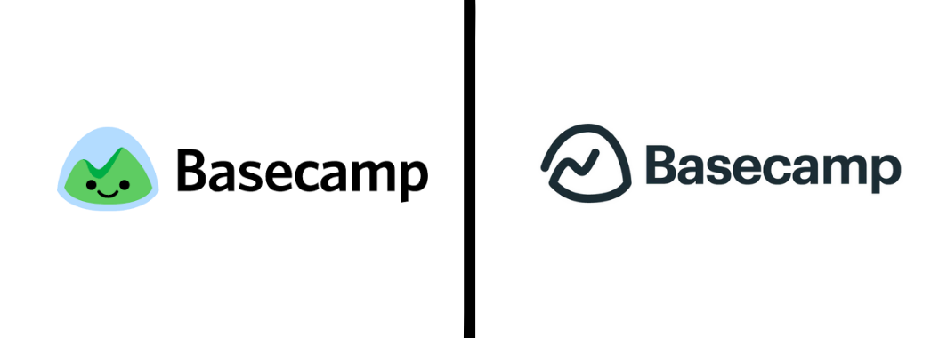
Basecamp
As avid Basecamp users, we couldn’t help but notice that the smiley green mountain has been swapped for a more simplistic, clean logo. We think this fresh iteration gives the brand and logo a more grown up, refined persona.
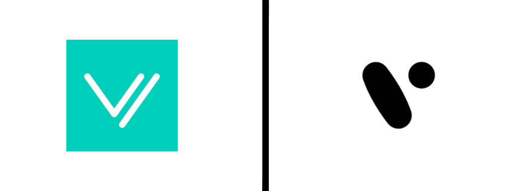
Divvy
Divvy, a business budgeting app that we also use here at CO OP, has upgraded their look as well. They’ve gone for a more abstract black and white design. Both Divvy and Basecamp seem to be shifting from a demeanor that is borderline ‘too friendly’ to one that targets the polished professionals that utilize their platforms the most.
DocuSign
Yet another rebrand that aims for modesty, DocuSign’s logo no longer has the frivolous ‘handwritten’ aspect to the typeface. The new logo is uncluttered and gives the brand a more contemporary feel. This rebrand reminds us that as brand recognition increases, the need to visually illustrate what a company is or does within the logo itself becomes less and less necessary.
Snapchat
Snapchat has been bold this summer… The new application icon features their signature ghost shaped logo outlined in a thick, bold line. As brands start to lose their initial attraction, sometimes the best way to retain loyal followers is to ensure the brand doesn’t go unnoticed. Users definitely won’t miss this new icon when they unlock their screens.
Honorable Mention
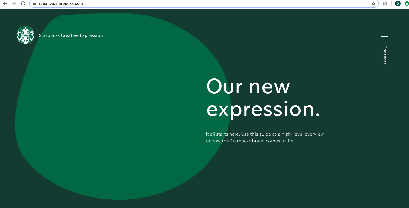
‘Starbucks Creative Expression’
While this isn’t a new logo or rebrand, we wanted to give a special ‘Creative That Works’ shout out to Starbucks, who have created the ‘Starbucks Creative Expression’ website this summer. This site acts as a platform for the company to showcase their brand guidelines and be more transparent about their creative process overall. Bravo, Starbucks. Check it out and get a peek at their full brand guidelines here.
These are just some of the many rebrands that have been launched this summer. We’re looking forward to seeing plenty of others and inspiring new creative this fall.


