Radian

Boston, MA
Forest City Ratner

Misunderstood, Misplaced and Missable

A stunning architectural statement at the heart of Downtown Crossing in Boston shouldn’t have posed a tough marketing challenge. However beautiful the building and however sensitively amenitized, the building posed a challenge to brokers and potential residents alike. As the first residential building in a primarily commercial neighborhood, no one knew what the building was offering or who it was for.

Taking a progressive view of luxury

Boston has a very clear set of expectations; it’s an international city rooted in heritage; it’s a progressive city that respects traditions. But the building wasn’t going to differentiate itself by conforming to those expectations. We focused on Boston’s growing young sophisticates, able to afford more, expecting a global standard of luxury. So we positioned the building as a symbol of their progressive discernment. We defined this as a personal mark of progress.

Where Outward meets Inward

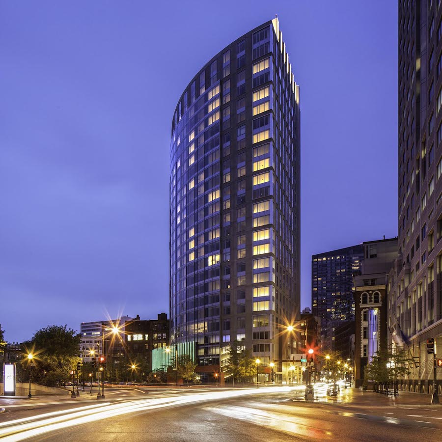
To help people understand the unique offer of the building we found an external expression of the inward qualities of the building. The name Radian was inspired by the physical quarter-circle shape of the building, but it also communicated the sophisticated energy radiated by the place. But most explicitly we carefully curated the ground floor restaurant to act as a guide to the building’s brand. Matt Jennings’ Townsman was eclectic, unexpected, not from Boston, cool, lively and a perfect way to explain our residential offering upstairs.

How We Made Radian Work

Brand Strategy
Visual Identity
Verbal Identity
Brand Campaign
Brand and Digital Activation
Website Strategy and Design
Print and Collateral
Signage & Wayfinding

Secured By miniOrange