Ancora is redefining real estate by transforming anchor institutions into powerful catalysts for growth. Their innovative approach unites academic, civic, and commercial partners to build thriving innovation hubs. To support their next stage of growth, CO OP led a bold reimagining of Ancora’s brand identity, messaging, and property marketing. The refreshed strategy highlights their unique business model while positioning them to scale with clarity and impact.
The challenge with an unconventional approach is the pressure to fit expectations. In life sciences, many assume every developer looks the same. Ancora knew their proposition was strong but lacked a clear, credible voice. Through a comprehensive Brand Strategy, CO OP uncovered their true superpower—the ability to connect diverse stakeholder needs into one unifying solution.
Read More
This core brand idea aligned Ancora’s internal values and operations while sharpening external marketing for both financial partners and anchor institution clients.
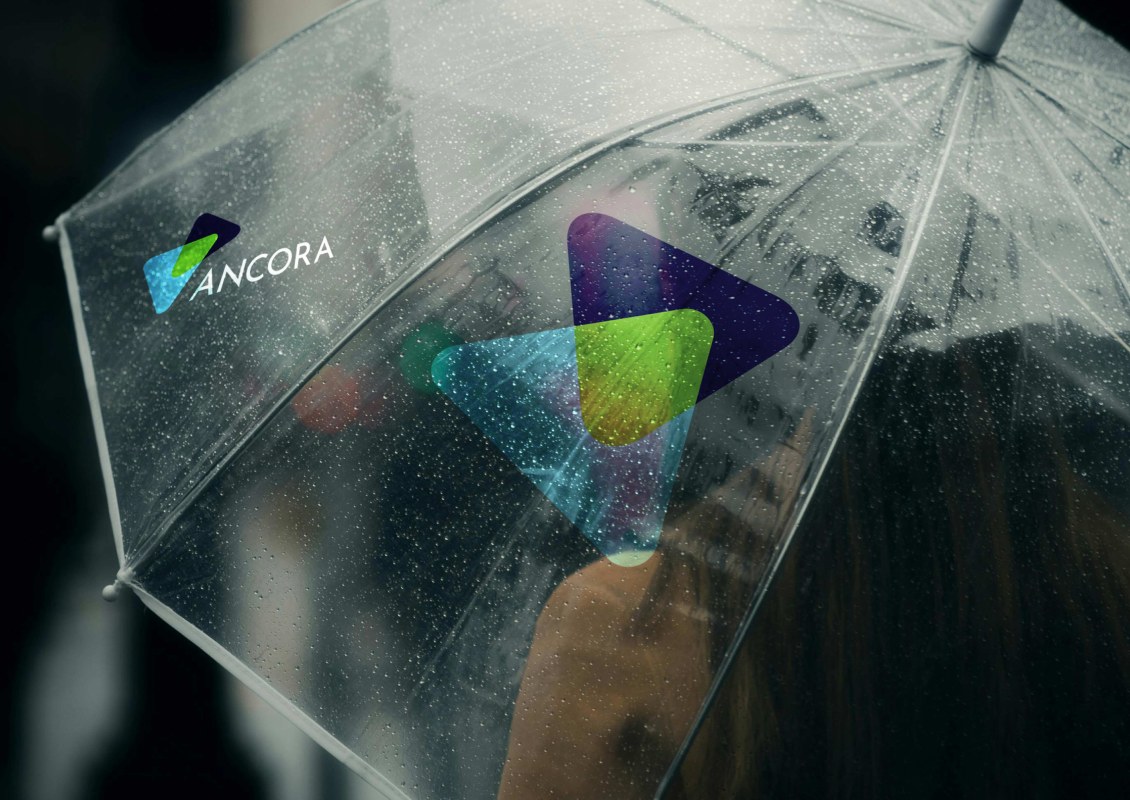
The visual identity was designed to showcase the benefits of connectedness. Our solution uses interlocking triangles that fit together in flexible ways. Where two shapes overlap, a stronger third color emerges, symbolizing the power of collaboration. The identity is fluid, adaptable, and future-forward, representing both internal processes and external properties.
Read More
Typography reinforces clarity and accessibility, while a bold color palette rejects traditional real estate norms. Instead, it draws inspiration from the academic and civic organizations that Ancora partners with.
CO OP designed Ancora’s website to clearly highlight what makes them unique. Instead of over-explaining, the site delivers a focused experience that simplifies their offer and impact. The message resonates equally with anchor partners, investors, and tenants, inviting exploration.
Read More
Subtle UX choices reinforce the clarity of the messaging. The language carries a distinct, hype-free voice—delivering simplicity while reflecting the complex solutions Ancora provides.
The power of connectedness shaped our property marketing strategy. Each name draws from local insight, strengthening ties to the institutions anchoring the projects. The PVD Labs reflects Providence’s local nickname, while Science at Square 10 honors the original master plan of New Haven.
Read More
Our flexible corporate brand design enables unique variations that highlight Ancora’s scale and individuality. This differentiation signals national excellence. Compelling marketing tools further elevate each property, building credibility, reputational interest, and lasting attractiveness within local markets.