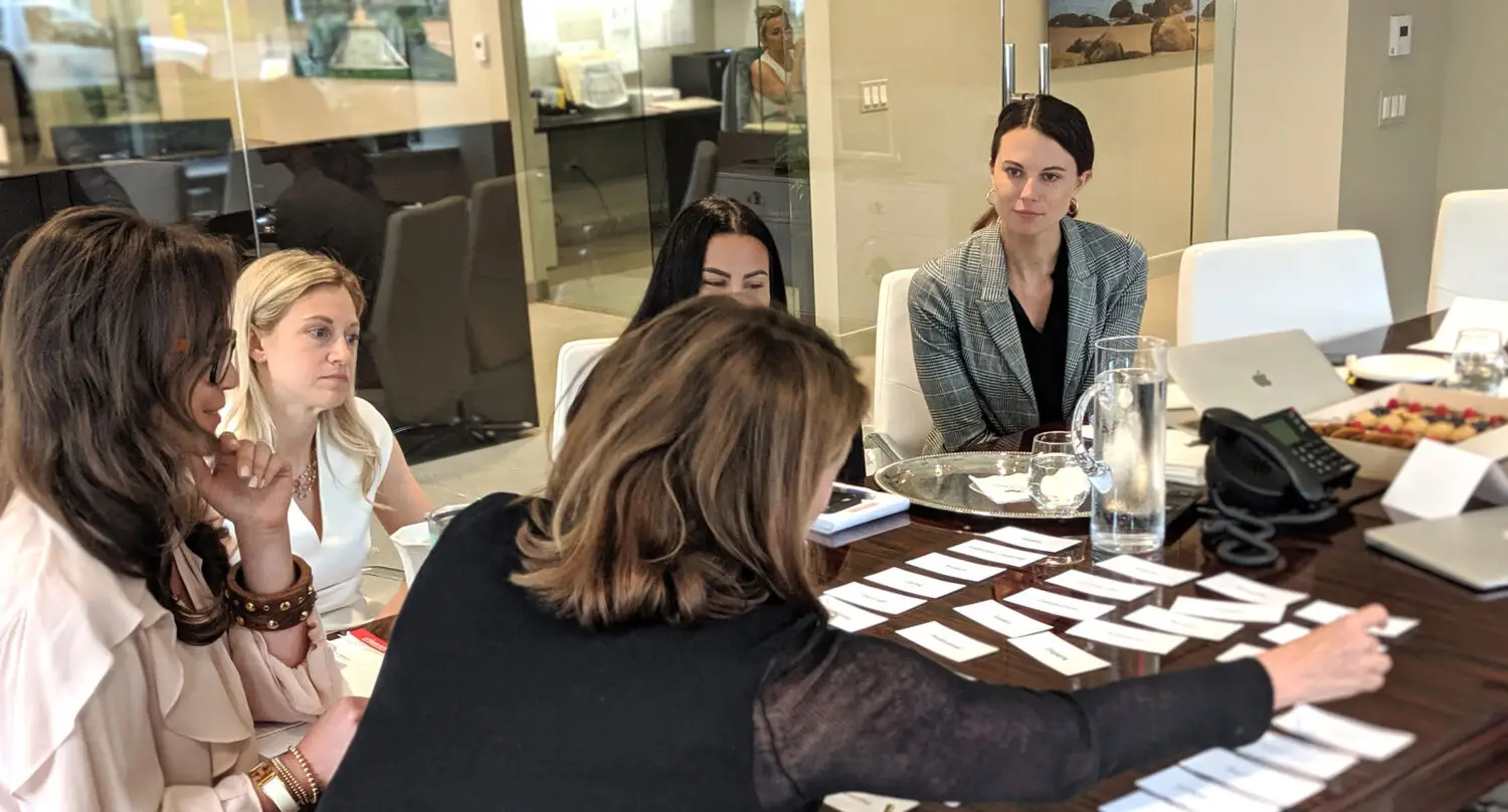
It’s in our name – CO OP. We have a unique cooperative way of working – internally and with our clients. It has seen us grow from our New York roots to an international branding and marketing agency.
Building success across real estate asset classes, launching new products, giving corporates new vigor and direction. We have faced up to challenges, achieved great things, and are committed to driving our future.
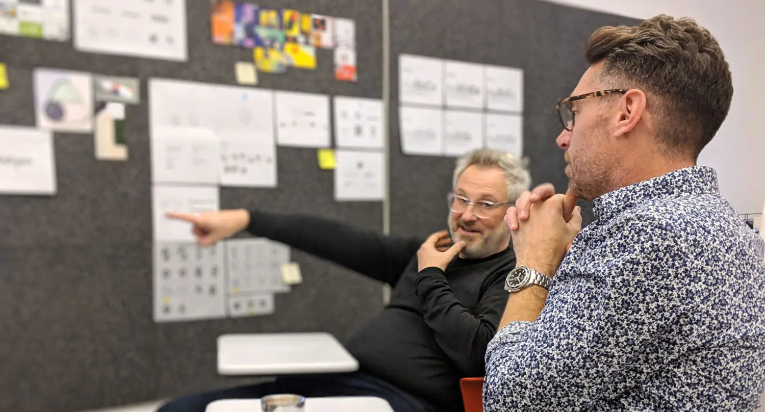
The difference that makes the difference
When you meet us, you’ll understand what makes us different. It’s more than powerful strategies, inspiring creative, and disciplined marketing. It’s a relentless commitment to making a difference, to going beyond, to constantly inventing new ways for brands to make a difference.
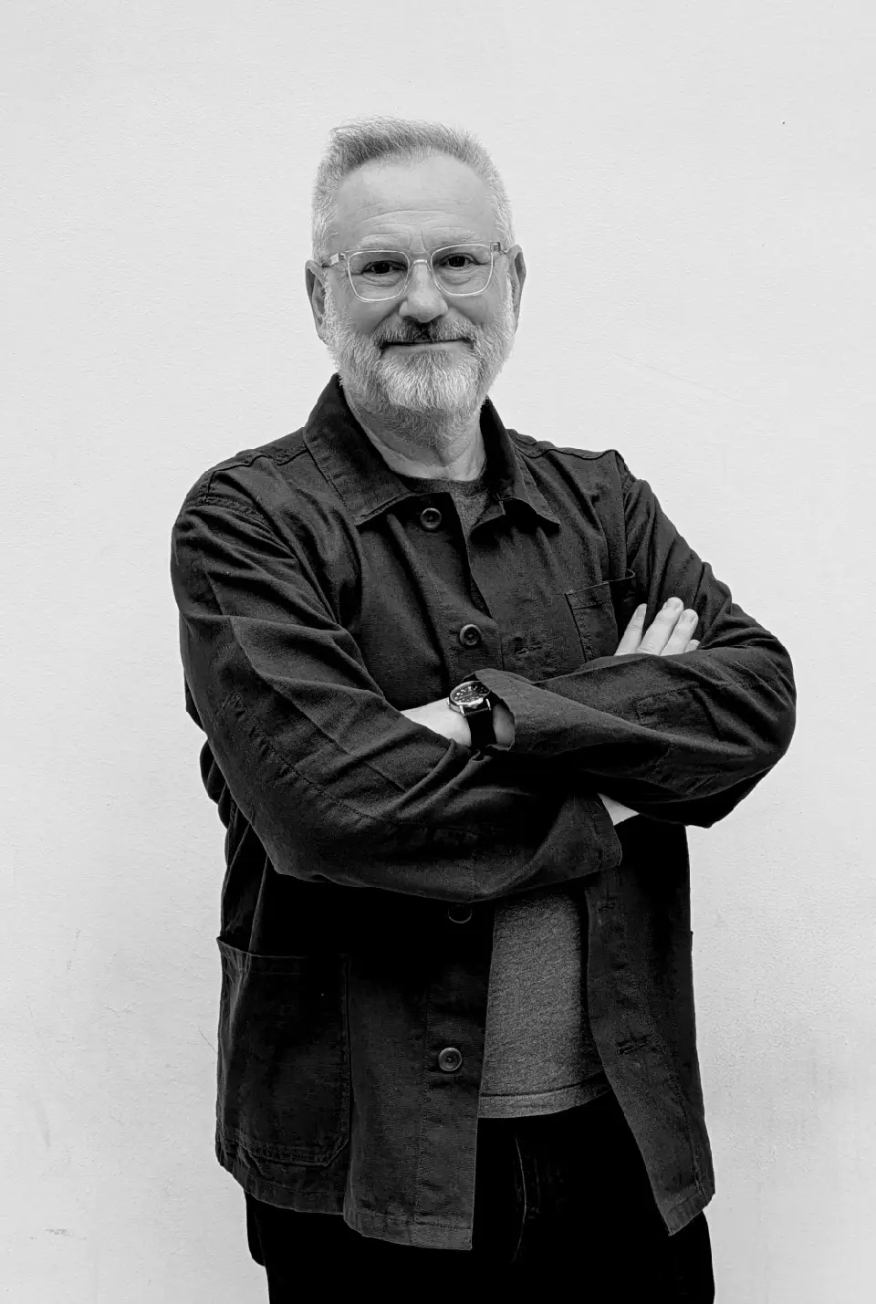
What you see is what you get
Leadership means hands-on leadership of every project. A commitment to excellence, the track record to know what will create value for our clients.