It began with a simple question: Why should co-living feel like a dorm? Why not something more elevated — like a private club, but cooler? ARC Westwood redefines shared living with striking architecture and a bold brand that empowers residents to live larger, louder, and more L.A. CO OP crafted the name, the visual identity, and the voice — all designed to help ARC residents live like icons.
SERVICES
Naming
Visual Identity
Verbal Identity
Website
SERVICES
Naming
Visual Identity
Verbal Identity
Website
Redefining the value of co-living
Redefining the value of co-living
Redefining the value of co-living
Redefining the value of co-living
Redefining the value of co-living
Redefining the value of co-living
Brand Identity
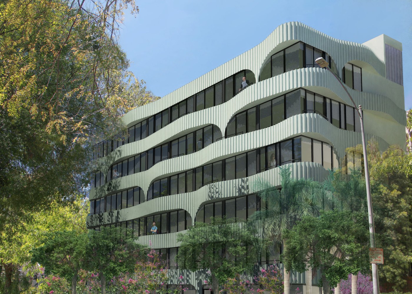
Drama on the Outside. Cool on the Inside.
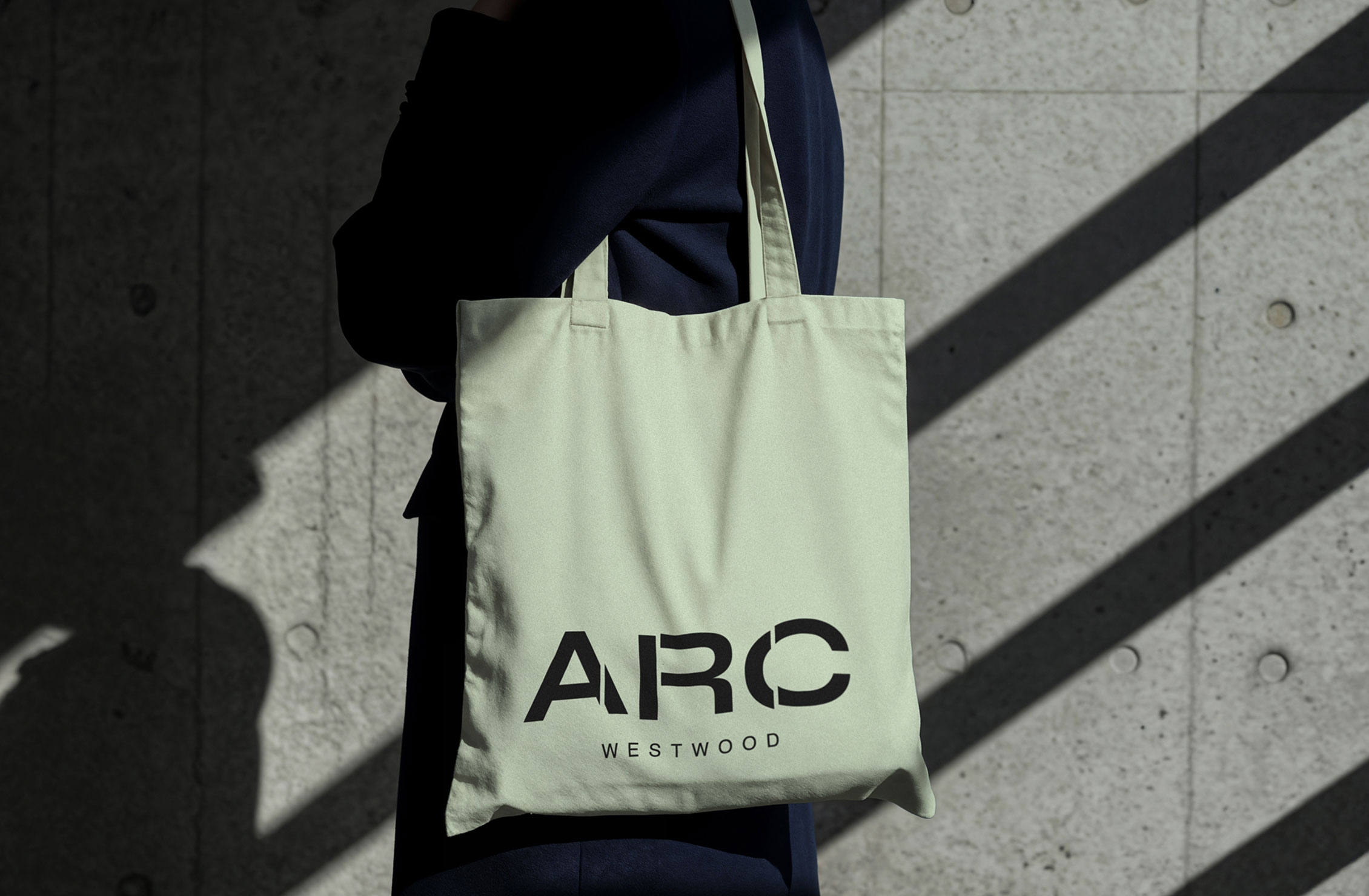
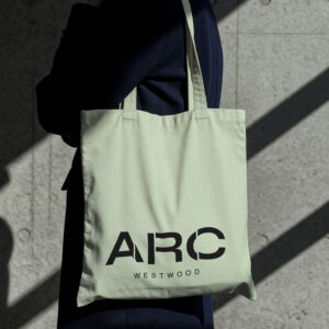
ARC Westwood isn’t for everyone. It’s for the bold, the stylish, the socially fluent — people with presence and plans. Its identity had to speak and shine: sharp, magnetic, and unapologetically original. Inspired by the building’s striking form, the identity signals ambition, confidence, and modern Westwood energy.
Read More
ARC Westwood’s brand lives where style meets substance. Every detail — from confident typography to expressive color and rich photography — was designed to pop on your feed or your jacket. The voice? Poetic meets hype, with an unmistakable L.A. edge. This is Westwood, distilled.
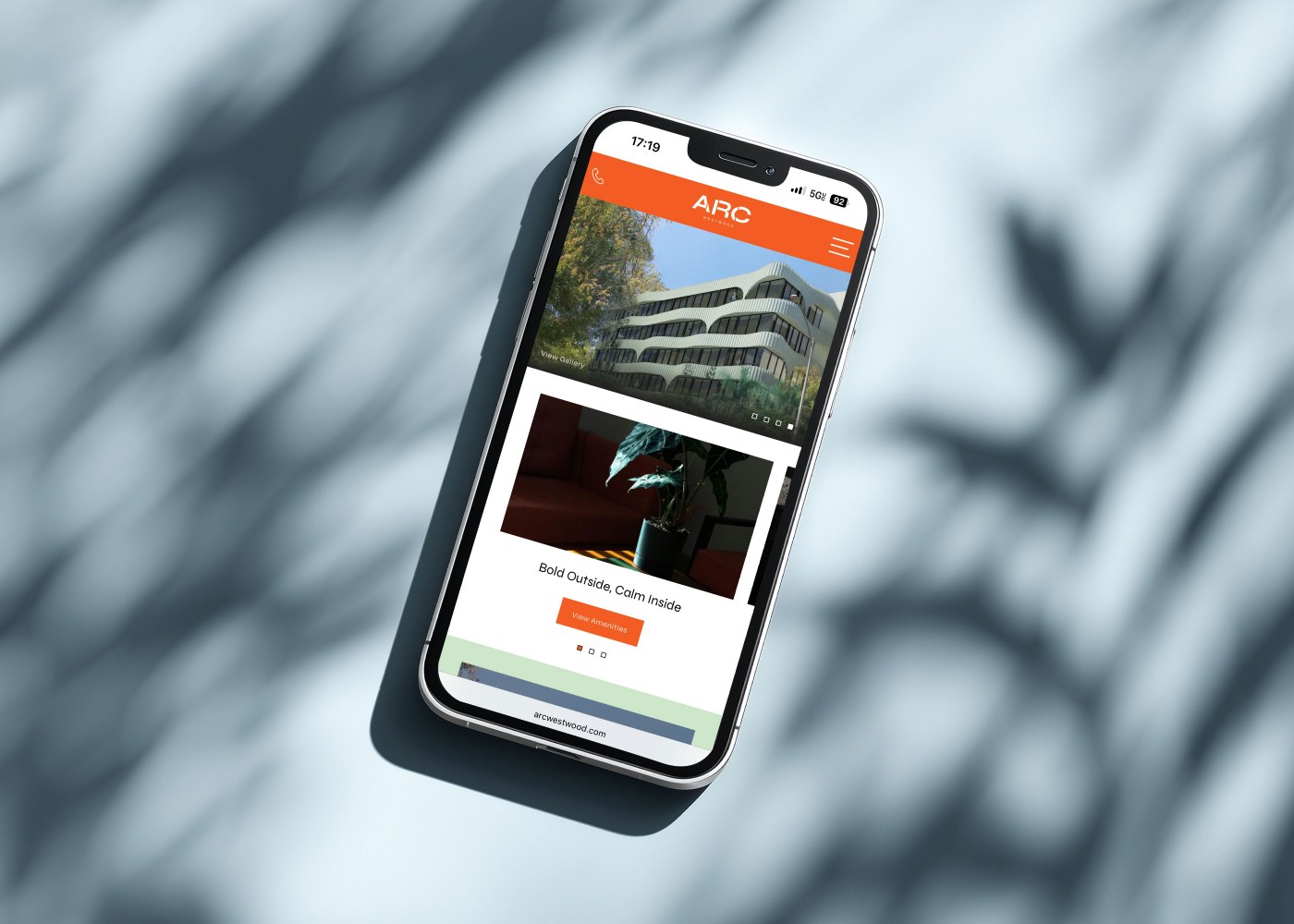
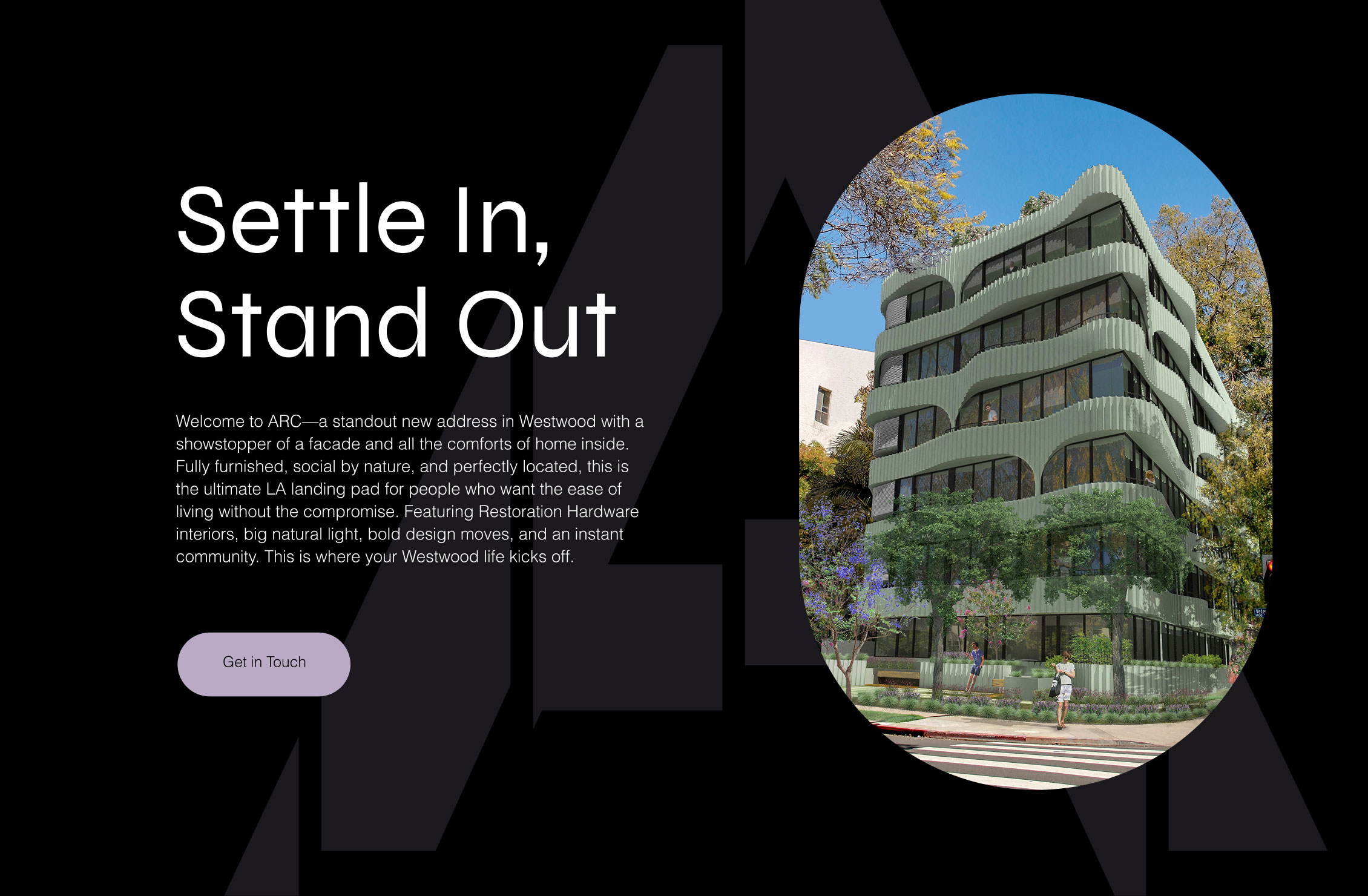
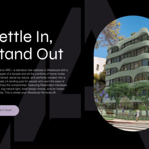
We designed ARC Westwood’s leasing website for maximum impact — fast, functional, and full of personality. Starting with a flexible template, we integrated essential tools and customized every detail to reflect the brand’s bold, stylish identity. It’s efficient, seamless, and uniquely ARC Westwood.
Read More
To capture ARC Westwood’s ambition, we crafted persuasive copy and curated striking visuals that bring its story to life. The site makes renting effortless — everything you need is front and center. And when you share it, it’s more than just a listing. It’s a statement: you’ve got taste.